Color Palette: Very Peri Pantone 2022 Color of the Year
The 2022 PANTONE Color of the Year is Very Peri 17-3938. This is an interesting choice. It’s a periwinkle shade with strong red undertones. It’s hard to appreciate this shade in a flat single color situation, but PANTONE presented it with applications in metallic and shimmering finishes, or in moving video form and it’s very dynamic!
I attended the PANTONE webinar announcing the color this week, and they went into the reason they created it. That in and of itself is new and exciting! This was the first year they invented a new color for the color of the year. Which is so fitting for all their explanations of what’s happening in the world. We are in a time of transition and this color represents that. It’s a little strange. It’s a little futuristic. It represents personal inventiveness and creativity, which has been vital the past year. It’s a transformational color, blending red and blue to create a newness. This is such an appropriate explanation as we move into 2022 with many uncertainties still. It is a color to represent transformation and innovation.
Do you have a strong opinion about the 2022 color of the year? I hope you enjoy this color palette collection, inspired by our brand new PANTONE COTY for 2022: Very Peri!
WATCH WISTERIA
HEX CODES:
#18237c
#523f90
#6768ab
#80aced
#d8d7f7
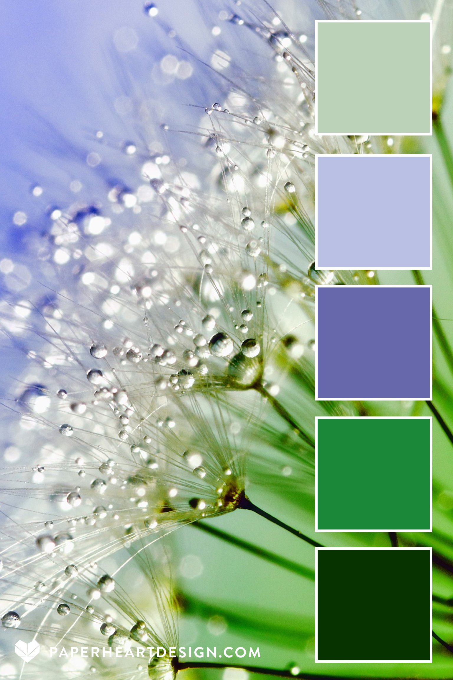
DEW DROPS ON DANDIES
HEX CODES:
#073300
#1b8839
#6768ab
#bac0e4
#bbd2b8
CLOUDY TEMPLE
HEX CODES:
#1c2729
#3c6da7
#6768ab
#9d90be
#d7d4f1
VERY PERI LAVENDER FOG
HEX CODES:
#1f172e
#a39eb4
#e7d4da
#6768ab
#fbebdc
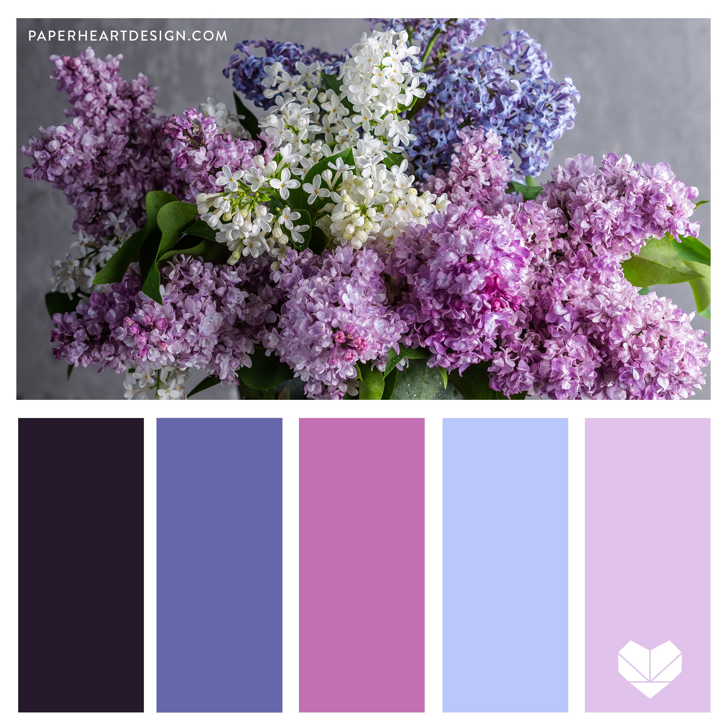
VERY PERI LILAC WINE
Lilacs are one of my all time favorites.
HEX CODES:
#26192b
#51588c
#c46fb2
#6768ab
#e1c2eb
COLOR PERSPECTIVE
HEX CODES:
#05204d
#004290
#6768ab
#dd98d1
#eab0a2
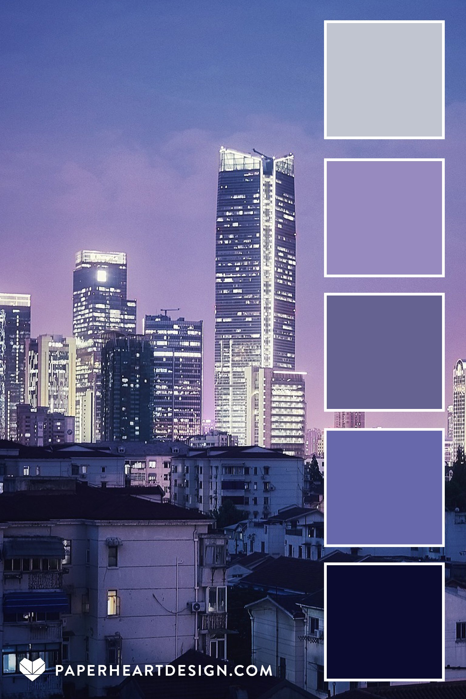
VERY PERI LAVENDER CITYSCAPE
HEX CODES:
#0b0b2f
#47589e
#656291
#6768ab
#c1c5d0
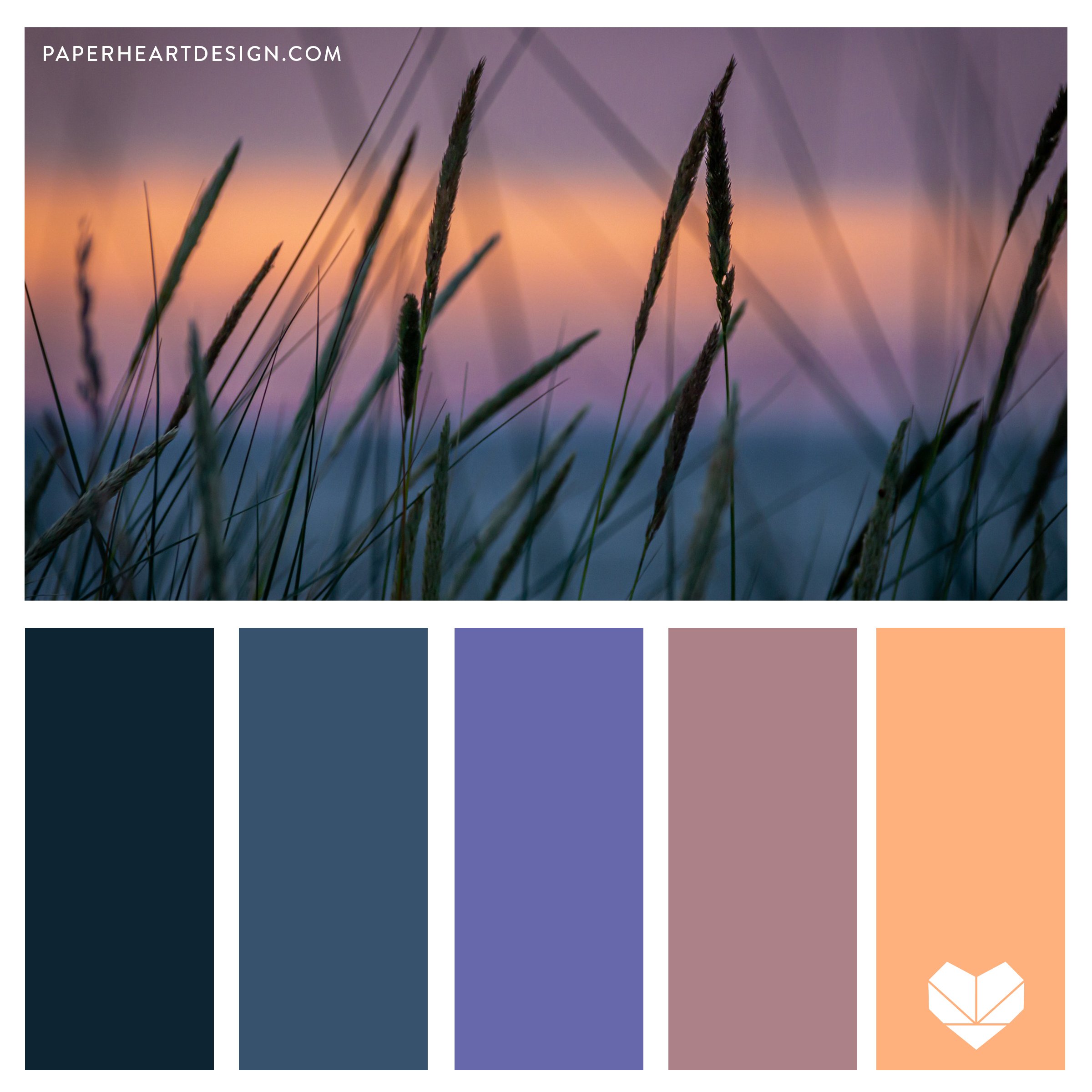
SOFT SUNSET
HEX CODES:
#0d2432
#37526d
#6768ab
#ac8188
#feb17d
VERY PERI AURORA
HEX CODES:
#282049
#096191
#53857a
#6768ab
#abeedc
VERY PERI LAKESIDE SUNSET
HEX CODES
#096191
#5956a3
#a297e5
#6768ab
#f8bbcd
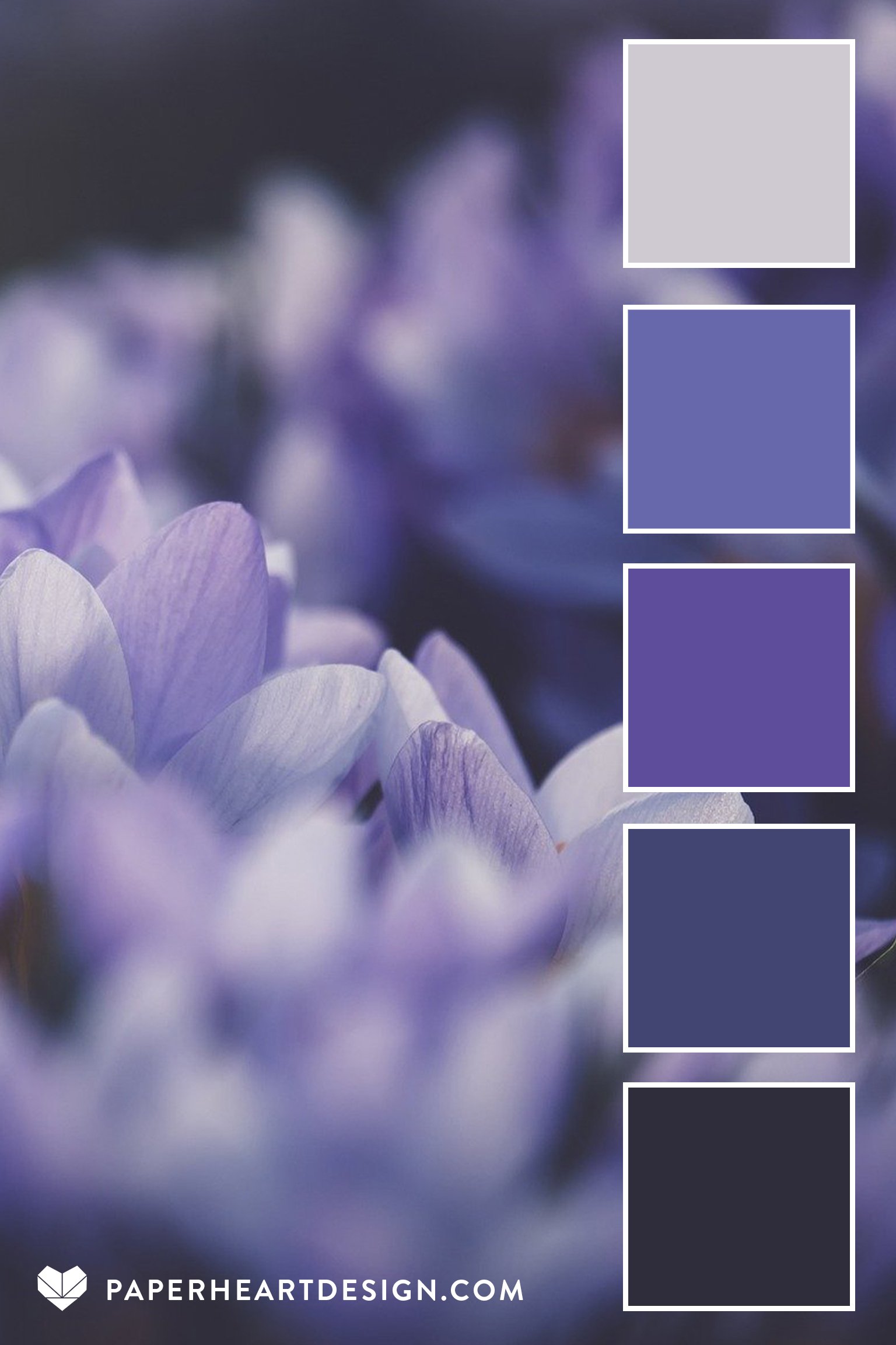
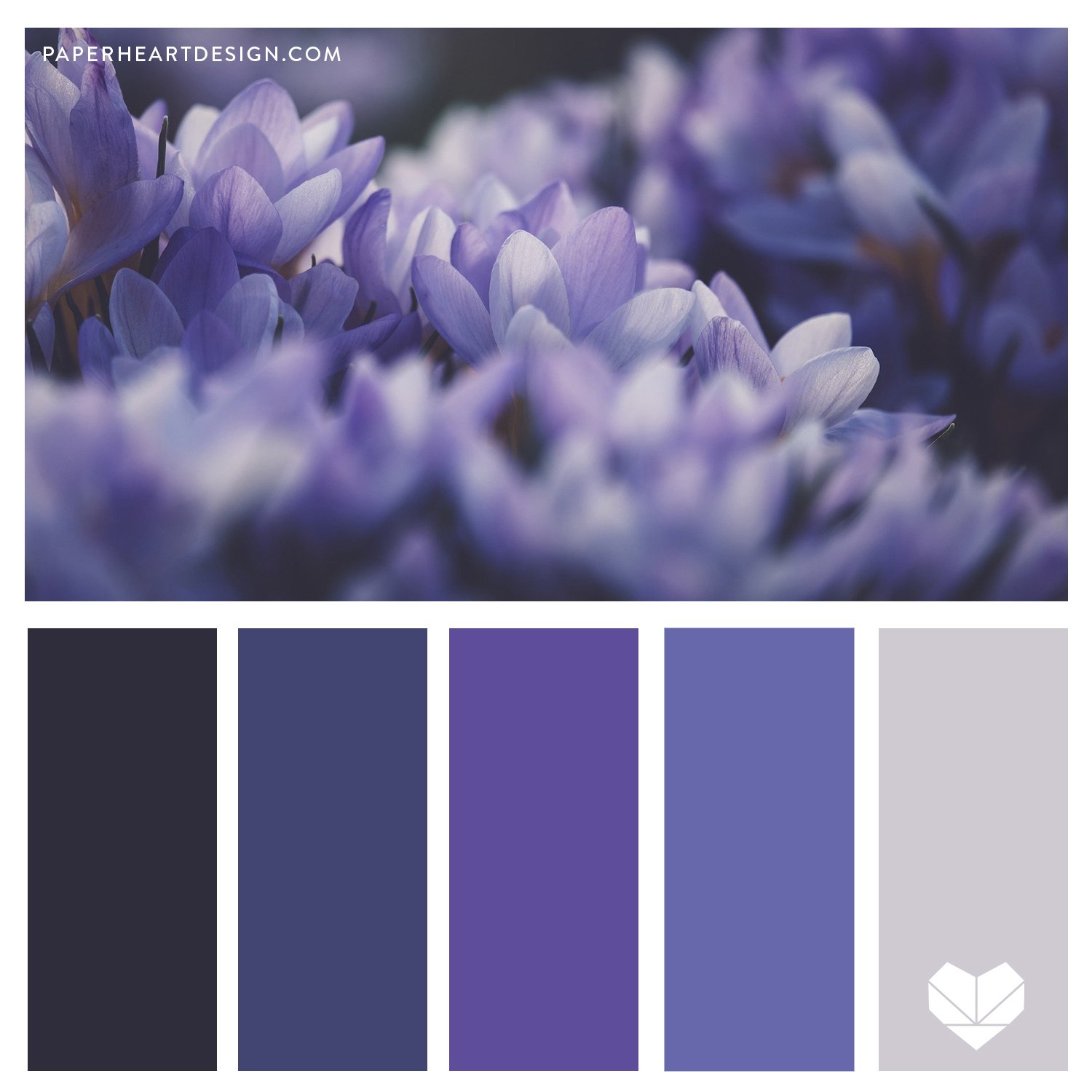
VERY PERI CROCUS FIELD
HEX CODES:
#2f2d3b
#6768ab
#5e4d9b
#9389bd
#cfcad1
VERY PERI MOODY IRIS
HEX CODES:
#060256
#340b35
#6768ab
#9774e8
#debbfb
VERY PERI CORAL SUNSET
HEX CODES:
#444154
#7a637f
#ff7062
#6768ab
#fec9c1
PURPLE HAZE
HEX CODES:
#210535
#6768ab
#7b337d
#c874b2
#f5d5e0
I hope you enjoy checking these out and I would love to hear how they inspire you! Let me know which is your favorite and what you would use it for (interior decorating, wedding colors, branding, wardrobe, painting, etc.) in the comments.
In an effort to foster a creatives community I’ve started a Facebook group called Art is a Record, the same name as this blog. I would love for you to join in the fun as we discuss creative living, projects, art, and life.


